What is font-size in CSS?
Font-size is the CSS property that sets the size of text. You can set it with an absolute-size keyword (small, medium, large), a relative-size keyword (smaller, larger), a length value such as 16px, 1.2em, or 1rem, or a percentage of the parent element’s font size. Relative values keep text scalable when users change their browser’s default size.
More About font-size
The font-size property in CSS controls how large text renders. Without a declared font-size, most browsers display body text at 16px, the default behind the medium keyword, and users can change that default in their browser settings.
Don't use font-size to make a paragraph look like a heading, or a heading look like a paragraph. Structure comes from your HTML: use real heading tags (h1 through h6) and paragraph tags (p), then adjust their size in your stylesheet.
How to set font-size in CSS
Write a rule that selects the element and gives font-size a value. At the 16px browser default, these declarations render:
p { font-size: 1rem; }renders body text at 16px (1 × 16px).h1 { font-size: 2rem; }renders the main heading at 32px (2 × 16px).figcaption { font-size: 80%; }renders captions at 80% of the parent's size: 12.8px inside a 16px container.
Because those first two values use rem, both sizes scale together when a reader raises their browser's default.
The values font-size accepts
Font-size takes four kinds of value:
- Lengths: px is an absolute CSS unit; text set in px still scales when readers zoom the page, but it ignores the browser's default font-size setting. Em measures against the parent element's computed font size, rem against the font size of the root (html) element, and ex against the font's x-height, roughly the height of a lowercase x.
- Percentages: relative to the parent element's font size, so 120% renders a little larger than the surrounding text.
- Absolute-size keywords: xx-small, x-small, small, medium, large, x-large, xx-large, and xxx-large, all scaled from the user's default size (medium).
- Relative-size keywords: smaller and larger, which size text against the parent element.
Keywords have a useful pattern: set a keyword font size on the body element in your CSS, size everything else relatively, and you can scale the whole page up or down by changing that one rule.
Px vs. em vs. rem: which unit to use
Prefer relative units. MDN's font-size reference warns that sizing text in px isn't accessible, because users can't change the font size in some browsers. Values relative to the reader's default size respect their settings. A practical rule:
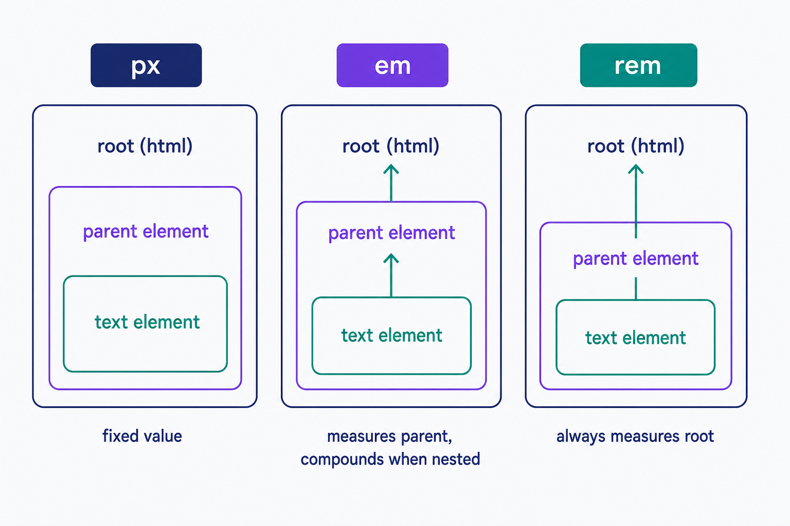
- Use rem for body text and most sizing. It measures against the root element, so 1.25rem renders the same anywhere on the page.
- Use em to size an element relative to its component, and watch nesting: because em measures against the parent, a 1.2em list inside another 1.2em list renders at 1.44 times the base size.
- Use px only where exact pixel control matters, and leave pt to print stylesheets.
Choosing readable text sizes
Keep body text at an effective 16px or larger; the U.S. Web Design System sets that as the floor for body copy. Headings step up from there: browsers default an h1 to 2em, twice the body size.
Size is only half of legibility. Line-height, the space between lines of text, carries much of the rest, along with your choice of font-family. Before you publish, raise your browser's default font size and reload the page. If the text scales with it, your units are doing their job.
Frequently Asked Questions
- Usually another rule is winning. A more specific selector, an inline style, or an !important declaration overrides yours. Right-click the text, choose Inspect, and look at the Styles panel: your browser's dev tools show every rule that applies and cross out the ones that lost.
- Yes. Elements inherit font-size from their parent, so an em or % value on a container resizes everything inside it, and nested em values compound. Rem values don't compound because they always measure against the root element, not the parent.
- Font-size sets the font's nominal size (actual character heights vary by typeface); line-height sets the height of each line box. They work together: if a paragraph feels cramped, try increasing line-height before enlarging the text itself.
- Yes, but sparingly. The U.S. Web Design System sets an effective 16px as the floor for body copy, so keep anything readers spend time actually reading at 16px or larger and treat smaller sizes as the exception.
Custom Website Design
Get a one-of-a-kind, mobile-friendly website that makes your brand truly shine. Share your vision with us and we'll take it from there.
Custom Web Design